
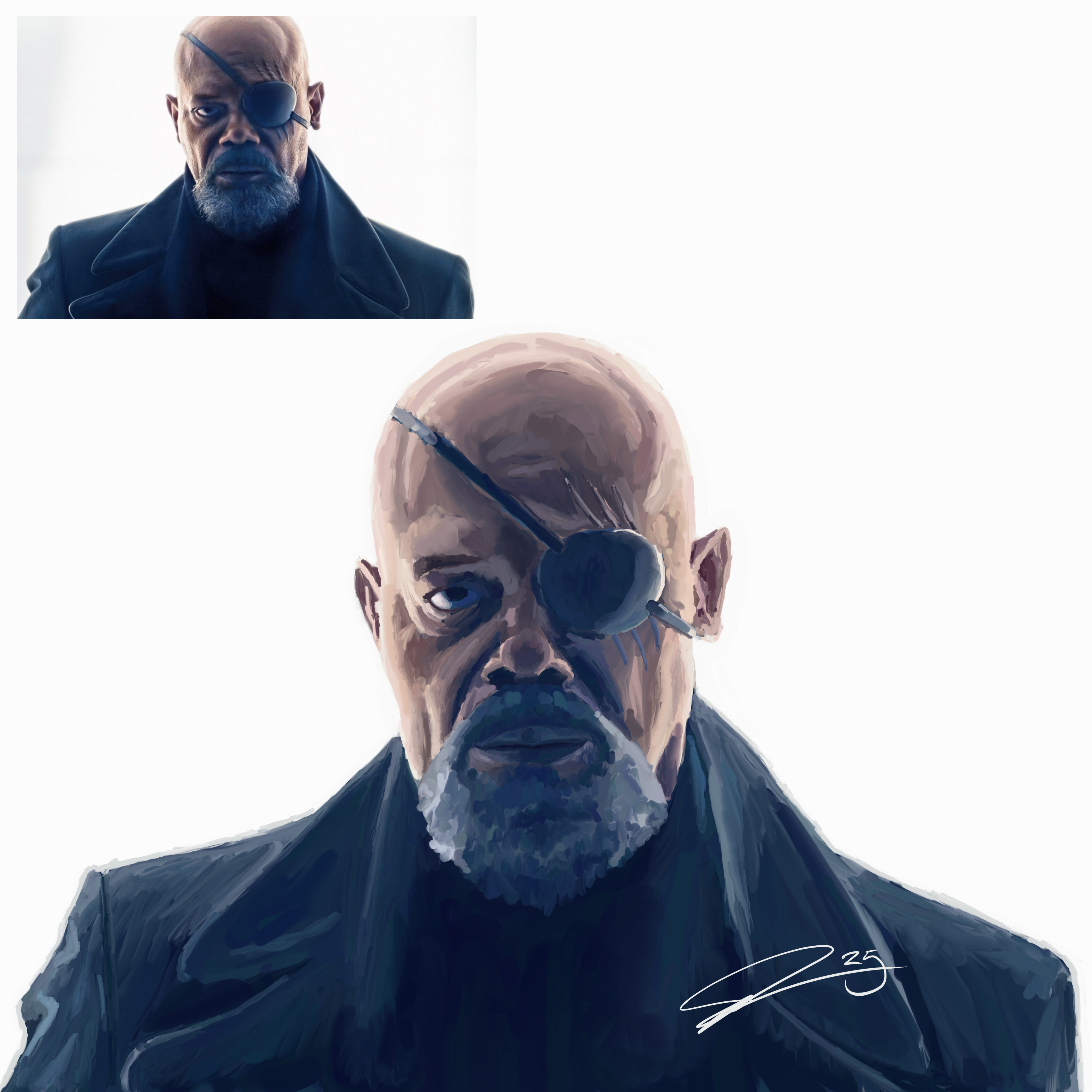
Clearly I can, but can I get his expression right? I think this is the closest to the expression in the reference yet. Not quite right but I’m not sure what isn’t right about it. I think it’s in his lips but I’ve redone them a few times and am no closer. Feedback?
Also I love love love how his beard turned out. I saw a YouTube saying don’t try to paint each individual hair and paint shapes that feel like hair, it was mind blowing to me.
And clearly you can tell which image got the most votes in the other post.
Edit: Also my workflow is getting much better. I spent less time on this than the first several I did with way better results. I’m able to see shapes and pick out colors I just couldn’t even see before.
You must log in or register to comment.
You’re pretty amazing. Great work and really noticable improvement!
Thank you, I’m trying!
These are so, so good.
I think it’s the eyebrow. Very very subtle but the angle is a hair different and can make the expression slightly different as well.
Thank you!
It’s not his lips, I think it’s his eyes, try making them a little more closed, he looks more wide eyed than in the reference
Thank you! I’m feeling pretty good about his left eye though 🤣
You got a point lmao, captured that emotion pretty spot on
Your best one yet
I think so too!
The edges of his lips are downturned in the photo, but they’re a bit upturned in your painting.
Also, his upper lip is stretched a little thinner in the photo, and pressed more tightly against the bottom lip.
I don’t usually reply to these, but since you asked, figured I’d mention.
Thank you!
I haven’t commented in a while. Having skipped a few I can see a lot of difference between them and now. The color choices and blending looks so much smoother and more nuanced. Your lights and darks are looking more dynamic, but could use a bit more work, it’s ok to get really dark and to hide detail if the artwork calls for it (the bottom of the photo has the jacket and shirt almost too dark to see detail while the painting just a smidge too light in tonal value(dark vs light)). Keep up the fantastic work.
That’s the biggest thing I saw when I painted it but decided not to try to change it with a filter or repaint it. But yeah it’s for sure a big difference.
Agreed, finish a work and move forward. Don’t linger on something to get to “perfection”. Strive towards that in the next painting. These are always a delight to see, a bright spot in my day when things have gone sideways.
I’m glad to hear that and I hope for better days for you!
And agreed iteration is a big part of improvement. Trying to do as many as I can before I’m able to do my next live session. With luck the next model I paint will actually look like them.
It’s, and I’m no artist, so forgive me if I’m wrong, the very ends of his lips. They go down in the original, but in your drawing, he’s very slightly smiling, as the ends of his lips go up.
Still, very good drawing!
Thank you!
